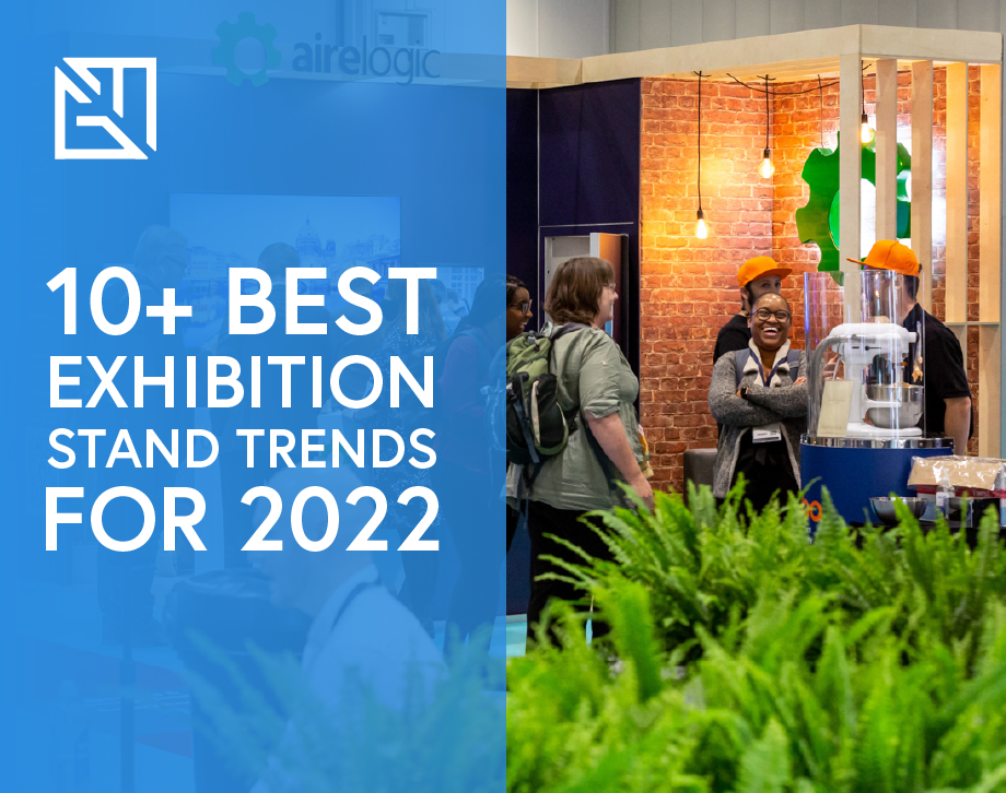
Read on to discover how to design high impact exhibition stands on a budget.
Graphic Mill are often contacted by clients who require a high impact exhibition stand from a relatively small budget. One of our strengths as a business is being able to meet the challenges presented by our clients, and in doing so, squeeze the absolute most from any size of budget.
More isn’t always more
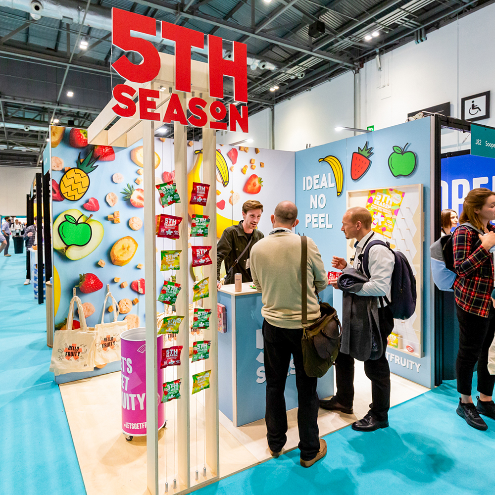
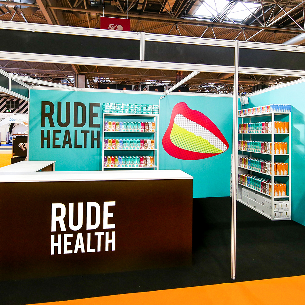
To create exhibition stands on a budget, we adhere to a ‘quality not quantity’ policy. If each element of your stand has been carefully considered, beautifully designed and accurately built, we don’t necessarily need a knock out budget to create a knock out stand. For example, see the below shell scheme stand we produced for Rude Health, for which the function of their stand was centred around customers sampling their product. When you break it down, all we’ve created is wall graphics, carpet flooring, a welcome counter, and off-the-shelf shelving units, yet the quality and crispness of finish makes the overall package one that’s imminently eye-catching and product-enhancing, whilst elevating the brand above other shell scheme stands around it. In this sense, minimalism works when executed well.
Flooring – maximum impact, minimum expense
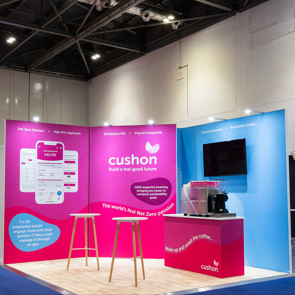
There are many ways to take your exhibition stand to the next level, however not all of these means are in reach of those on a small budget. When looking at creating exhibition stands on a budget, flooring is an impactful yet overlooked consideration. Space only stand packages won’t include flooring, and whilst some venues offer a basic shell scheme carpet, this is usually single use and not in a colour which compliments your branding. Graphic Mill offers a wide range of flooring options, from cushioned carpets, to reusable wood effect vinyl. The impact the flooring has on your stand can be huge, and is a surprisingly cost effective way of increasing your stand’s wow factor.
Embrace off-the-shelf options
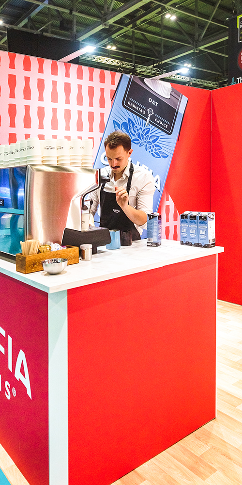
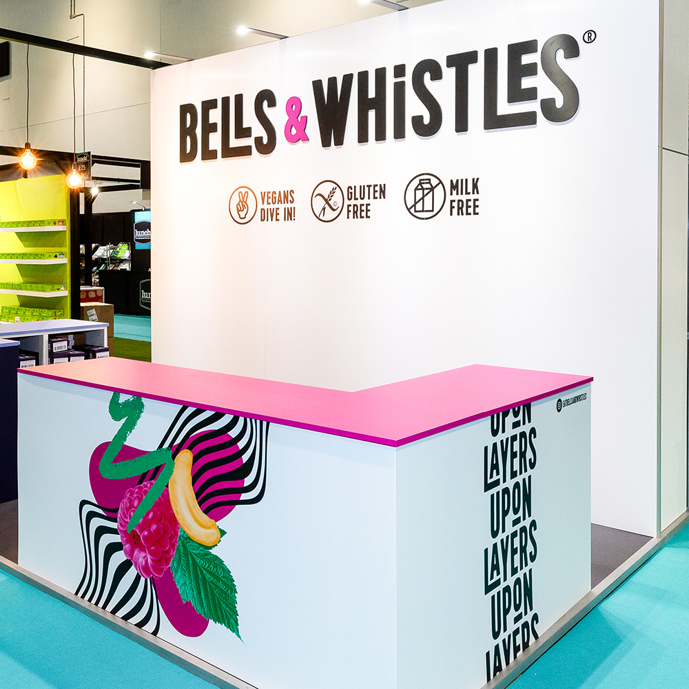
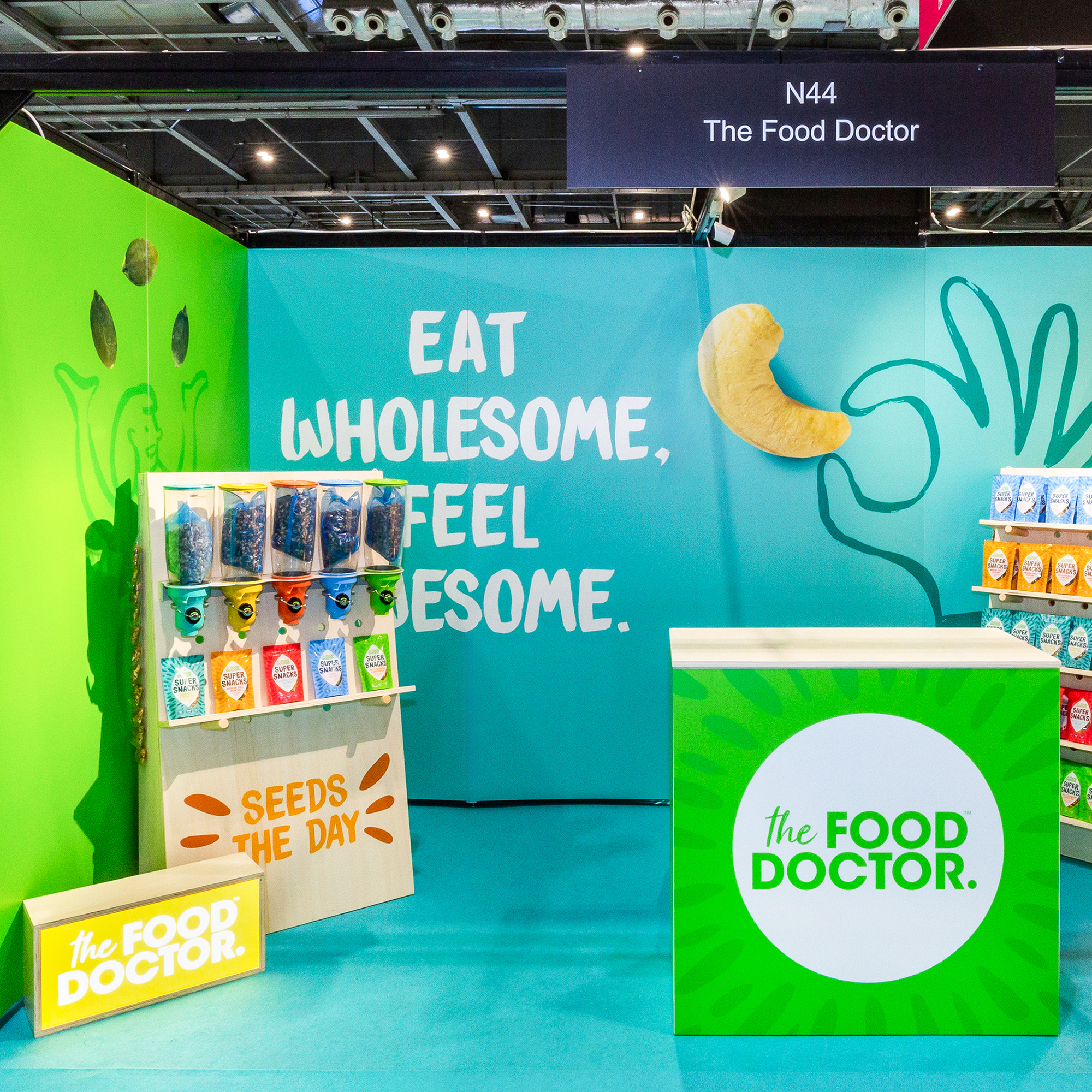
Bespoke furniture can be the perfect way of displaying your product or creating meeting spaces for your customers. Small budgets however may struggle with the costs attached to the required labour and high cost of materials. Why not consider utilising off-the-shelf options instead? At Graphic Mill, we often advocate the purchase of IKEA furniture and personalise it to bring it up to spec. For example, counters or shelving units can be easily wrapped in printed vinyl, allowing us to apply your own branding or logo to create another high impact product which still feels high-end but is also ideal for a small budget.
Create a ‘hero’ element
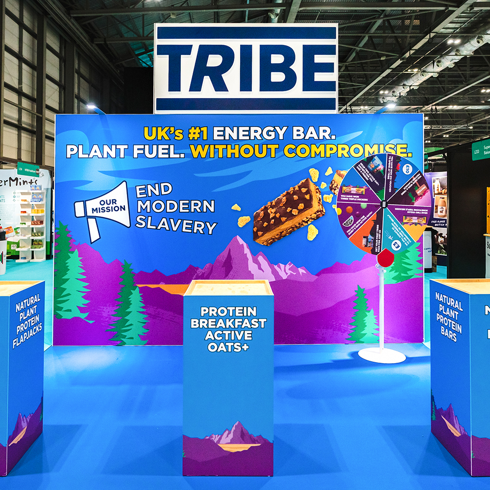
Once the fundamentals of your stand are established, you might decide you have the budget to add something a bit more unique which will act as a talking point and stick in the minds of visitors to your stand. This can be a large lightbox logo, oversized 3D product sculpture, or quirk product display. These features can often be built to last, meaning they can be reused at multiple shows, activations, retail opportunities, and evening as a point of interest in your office!
Wall graphics with reusability in mind
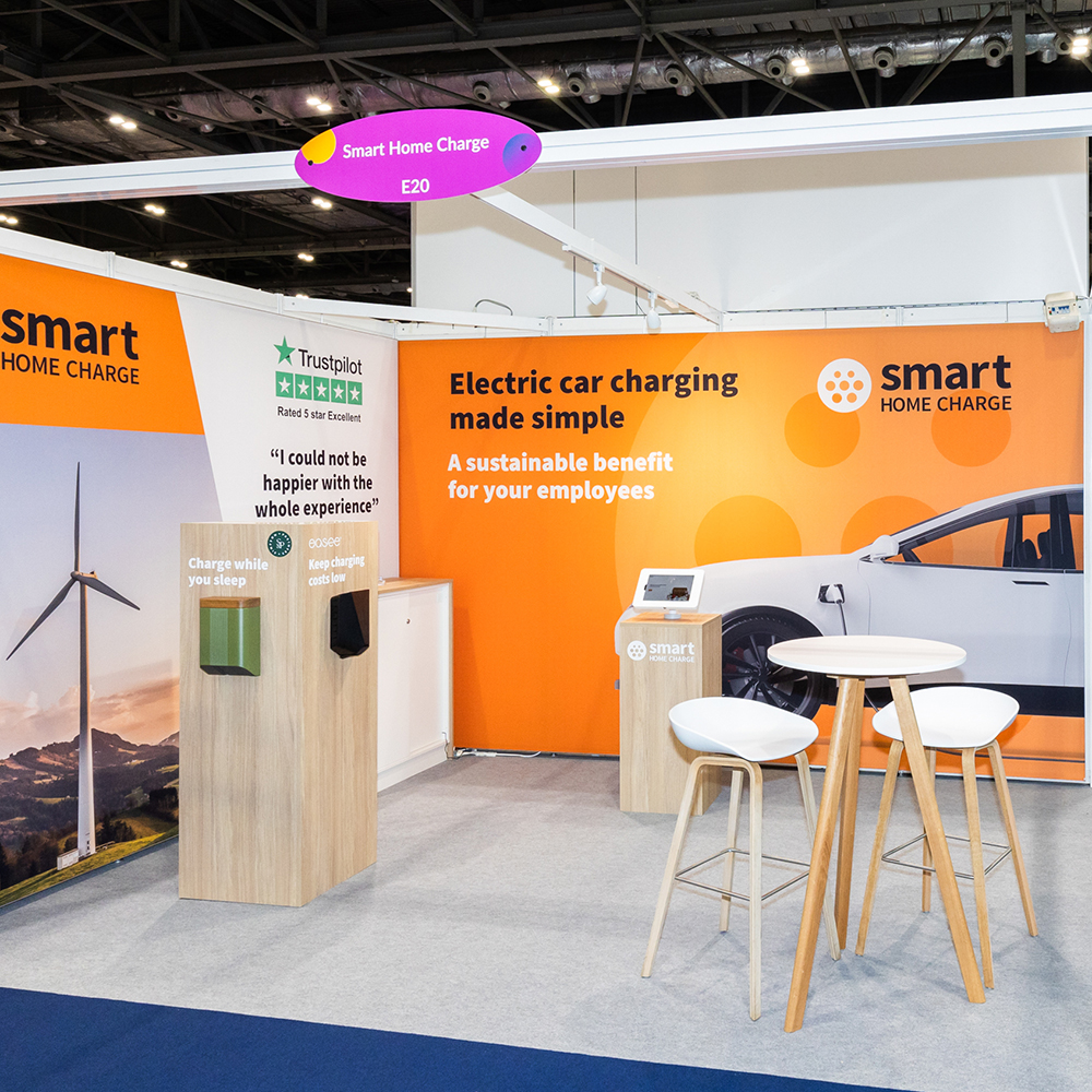
Don’t fall victim of the false economy which can be trade show walls systems. Many cheaper solutions seem great budget-wise, but lack the impact your brand deserves, and leaves you with a single use product which zero reusability. Whether you need wall graphics for you shell scheme or space only stand, investing in this area can save you money down the line. Unlike printed foamex panels which aren’t seamless, prone to warping and are single use, or unlike hugely expensive wooden wall structures which are disposed off after the show, the wall structure we use at Graphic Mill is 100% reusable and supports our fabric graphics which are vibrant, seamless, and again, reusable across multiple shows and activations.
Hopefully this gives you a few ideas of how to design exhibition stands on a budget which are still high in impact. Why not get in touch to discover what we can do for you and your brand, at your next show.

