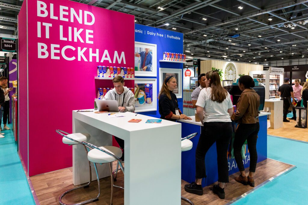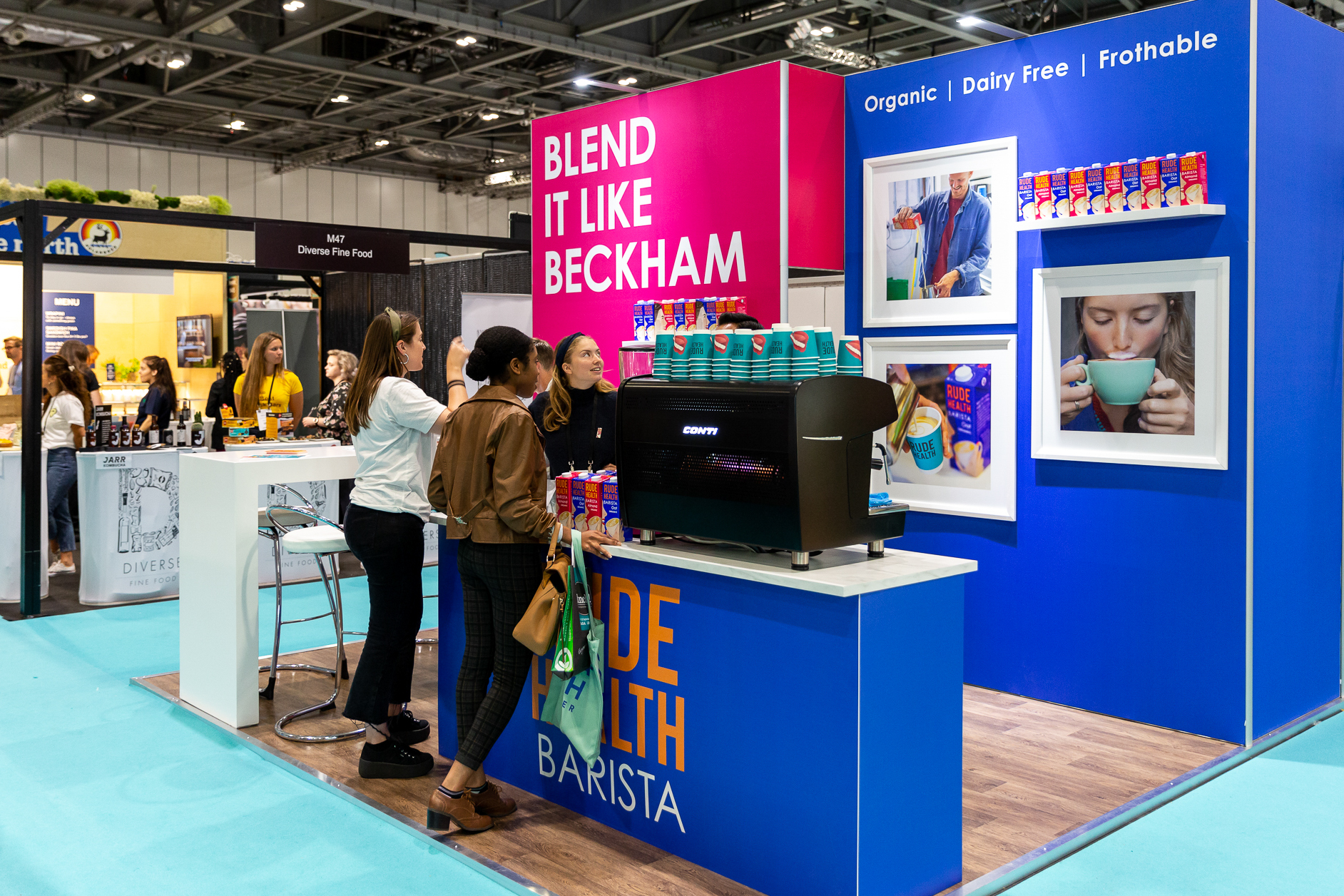
Showing off Rude Health’s wide range of dairy-free milk drinks at Lunch! Show.
The challenge
To design a vibrant and colourful café-style exhibition stand with a coffee shop vibe to promote the Rude Health range of alternative milks.
The result
An inviting exhibition stand with high-level branding that could be seen throughout the show hall.
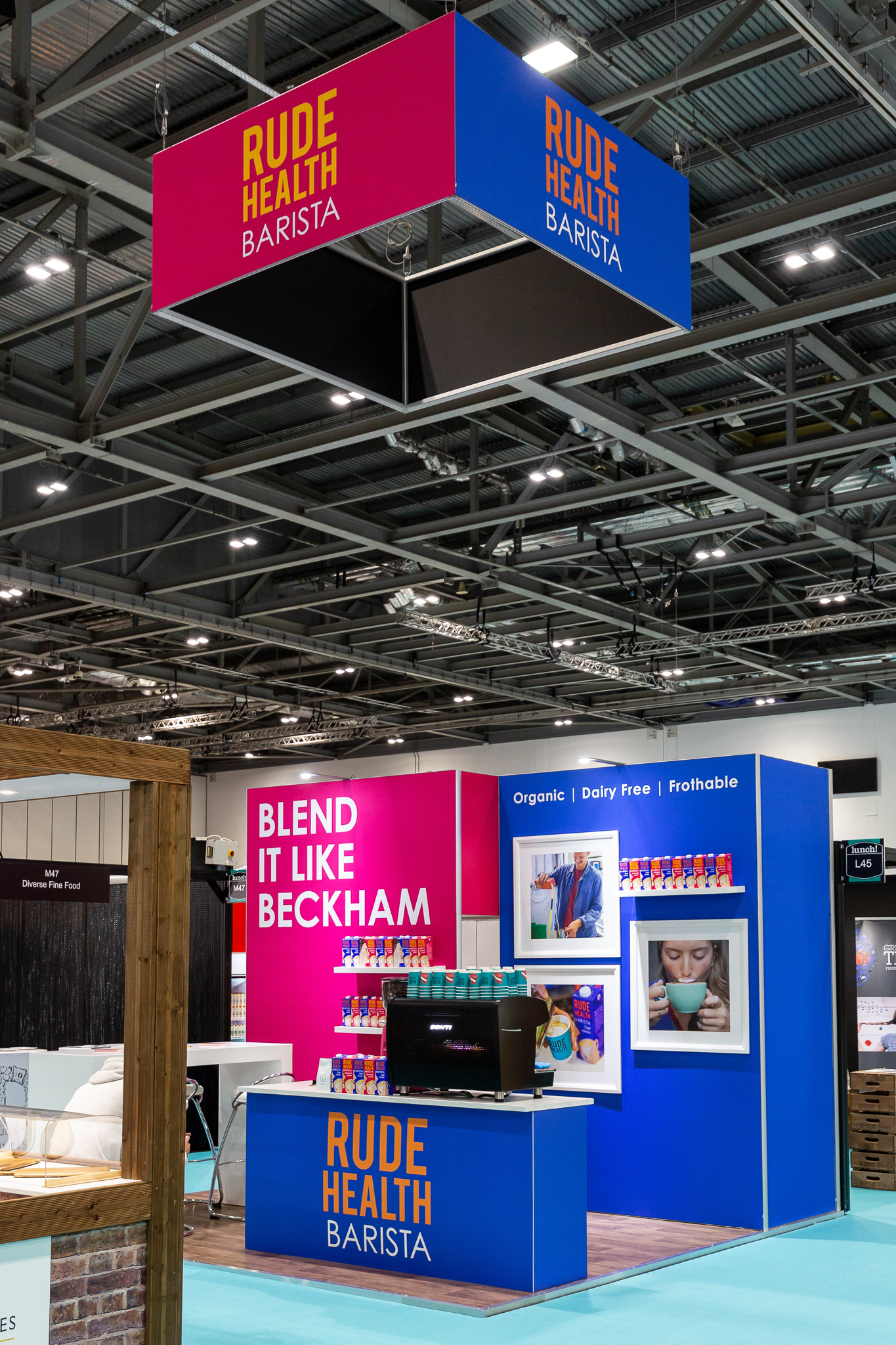

Rude Health have been a fantastic client of Graphic Mill, and we’ve worked with them over the years to design many of their exhibition stands and window displays.
In 2019, we helped to create a colourful Rude Health stand for Lunch! Show that could be reconfigured for future events. Elements from the stand have been used in various Rude Health projects, with the stand being fully reconstructed, with a few tweaks, for the 2021 Lunch! Show.
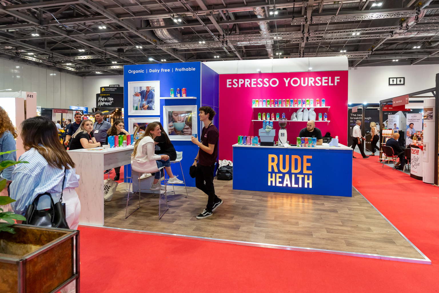

The idea behind the stand was to create a coffee shop vibe to match the Rude Health Cafe in Fulham. To help to achieve this, we added in a seated bar area, wood-effect floor and barista-grade coffee maker on an illuminated counter. The main walls displayed the full range of Rude Health milks and photo frames on the punchy flood-colour graphics.
Above the stand was a huge rigged branded box, displaying the logo across the show hall. Storage was an important factor, and a storeroom with a lockable door was incorporated to hide away product stock and staff belongings. The counters also featured shelving for the barista’s tools.
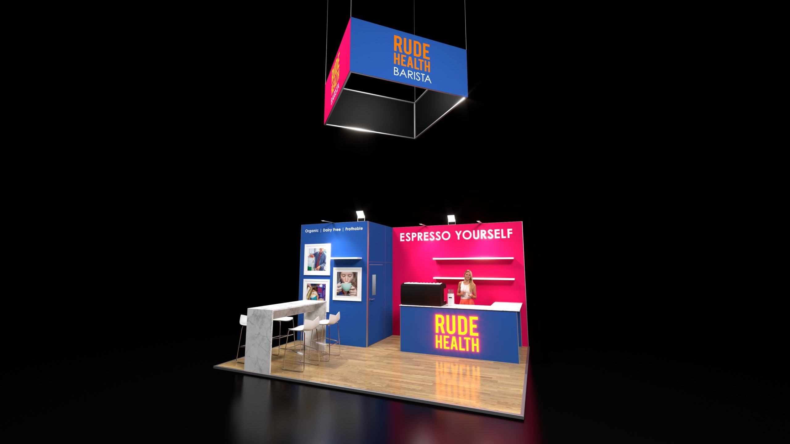

The stand was designed in an aluminium frame structure which was perfect for their aim of reusing the stand time and time again. The structure is super-stable, can be reconfigured easily and is environmentally-friendly.
The stand was drawn up in our 3D CAD software, and photo-realistic visuals were shared with the Rude Health team. This gave them a life-like representation of how the stand would look, enabling the team to plan their strategy for the show day. Once a 3D model is created, any tweaks to the stand such as new graphics or layout changes are simple to implement for future shows.
We pre-built the stand in our facility to ensure a smooth install on the day. When the stand was reused for Lunch! Show 2021, we tested all the elements to ensure they were in good order. Some elements, such as the counter, were updated to have a new illuminated logo, the backwall messaging was changed for their new brand campaign, and we added a bar area to the rear of the stand.
By opting for a modular stand, Rude Health had the ability to exhibit again and again with the same kit of parts. This allowed for inexpensive updates to the stand only when necessary, to ensure the the space was kept fresh and up-to-date with the latest messaging.
