When everyones favourite sriracha sauce company, Flying Goose, contacted Graphic Mill to design and build a fun and bold exhibition stand for a string of European trade shows, we were all super excited to create something memorable for them.
The challenge
To create a bold and fun exhibition stand which is modular and can be adapted to multiple shows across Europe.
The result
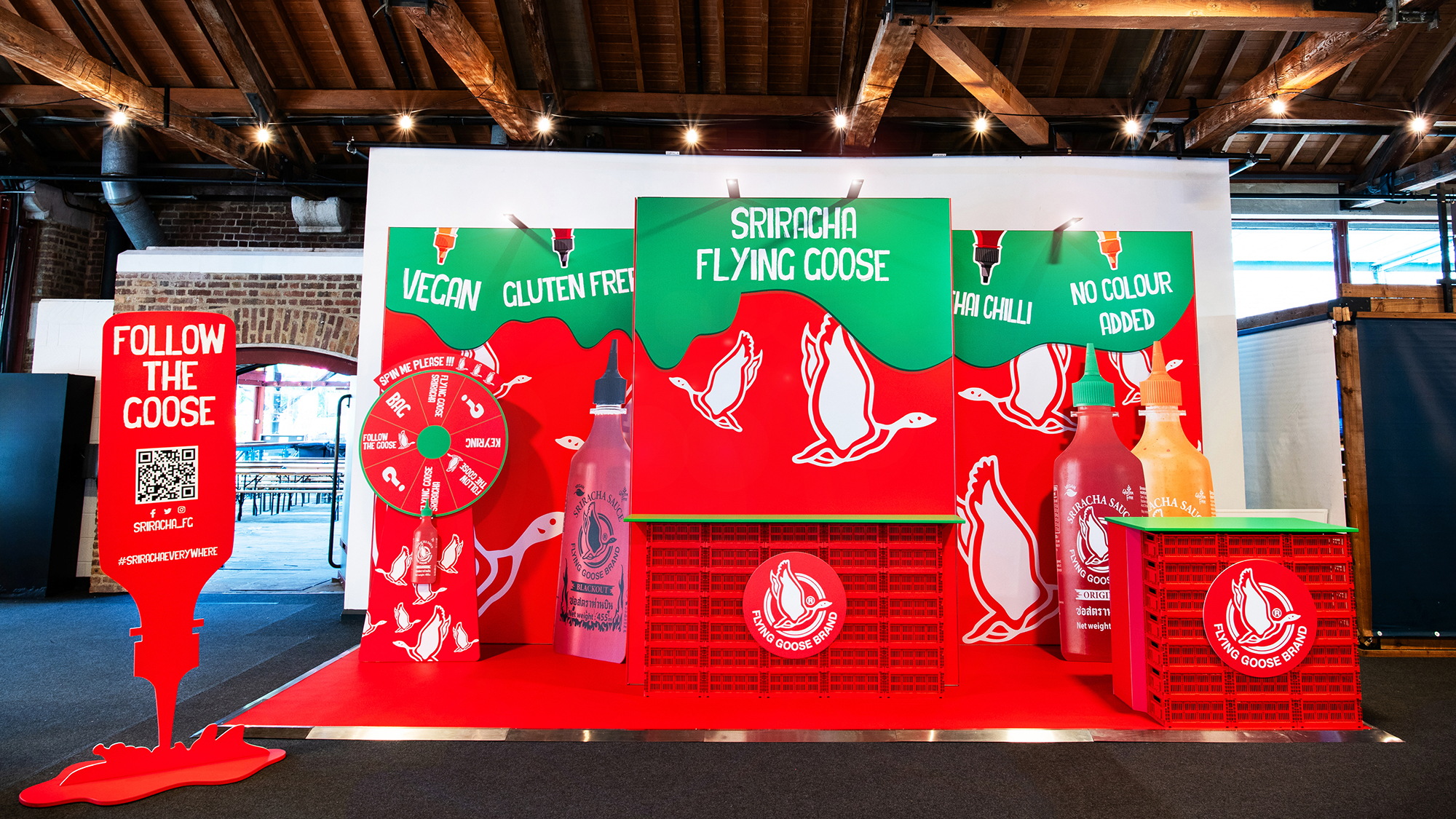
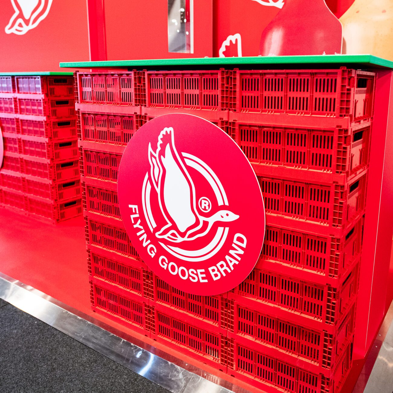
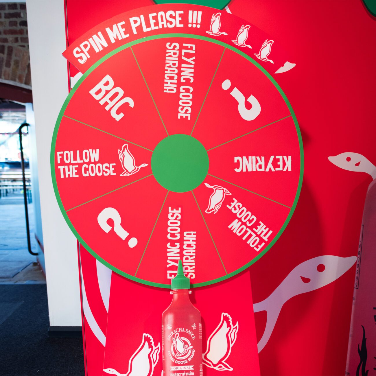
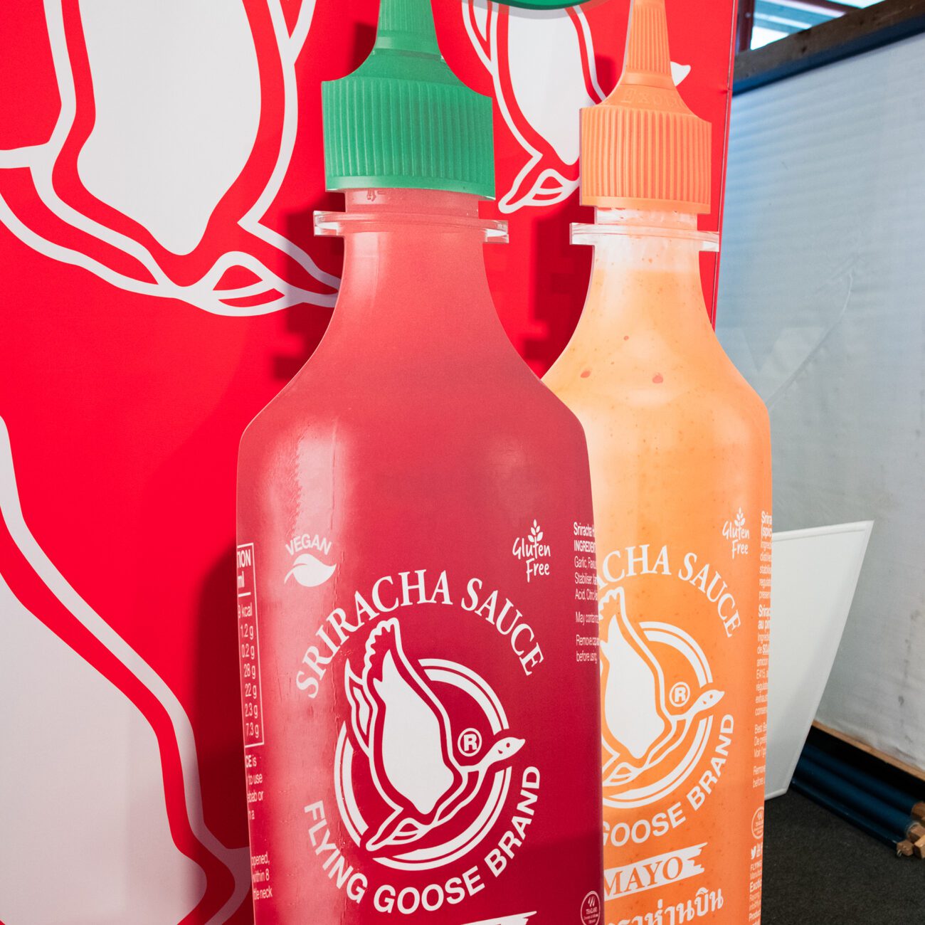
A stand that can’t fail to catch your eye, aided by vibrant graphics, bespoke counters, a spinning wheel to draw in a crowd and oversized product standees.
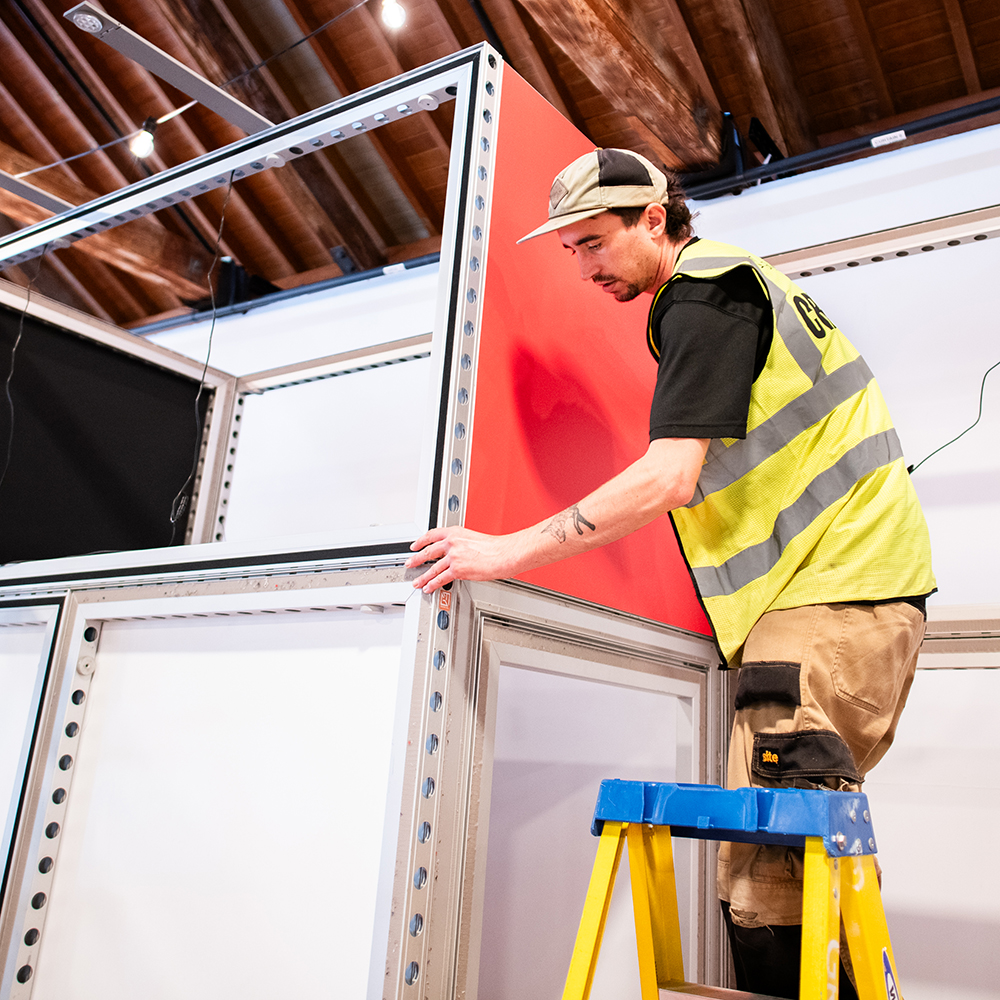
The challenge presented to us was their need for a stand which is reusable and can be adapted for use across multiple shows. For example, their stand for Meatopia at the Tabacco Dock in London, was to be used for POS, whereas at IFE (International Food and Drink Event) at ExCel, they’ll be occupying a larger stand kitted out with seating, tables and a cooking station. Using our modular wall structure, counter design and clever application of graphics, we were able to produce reusable assets which can adapt to the unique needs of each show they exhibit at.
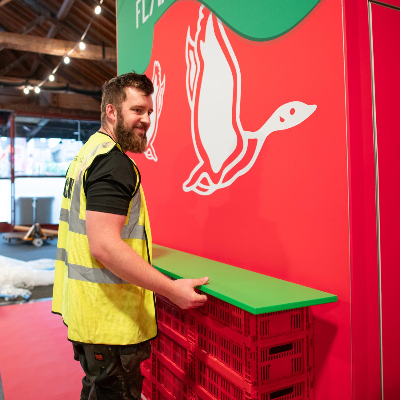
Another request from the client was to use red crates to portray a point of interest and elevate the fun factor in their counters. As it turns out, sourcing red crates that were fit for purpose was harder than expected! Luckily, Graphic Mill are blessed to have an incredible Operations Manager who sourced exactly what was needed, and allowed us to produce something which is bespoke, eye-catching and a real talking point. These crates were also collapsable, allowing us to effectively store them in-between shows and easily transport them from one venue to another.
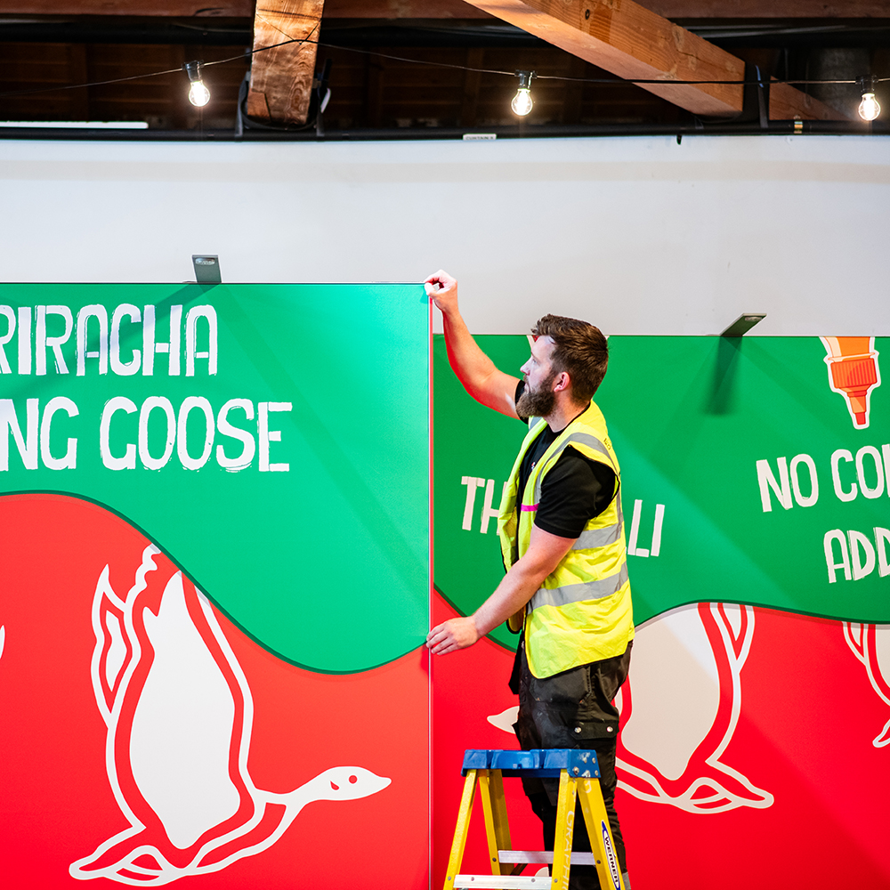
Flooring is an often overlooked element of any exhibition stand. The aesthetic impact can be huge, so this knowledge influenced our decision to use an on-brand red vinyl flooring, matching the fun and bold vibes were wanted to create. Our experience also tells us of the importance of quality lighting on a stand. If additional lighting isn’t implemented, even the brightest colours on your wall graphics can look dull under the venue’s ceiling lights. Our wall lighting system really helped to increase the pop on these wall graphics, picking up the richness of the colours.
To help the client create a buzz around their stand and the products they were selling from it, we produced a large spinning wheel to give customers the chance to win prizes. The client span this wheel at regular intervals, and provided the perfect conversation starter, and means to engage customers. This, combined with oversized product standees, helped to reinforce the fun element the client asked for, and added to the strong visual impact we were aiming for.
Finally, little details helped to make this stand as practical as it was eye-catching. As with all of our exhibition stands, we installed ramped edging to the floor, allowed for better accessibility to wheel chair users or those who have mobility difficulties. We built a handy store room which featured a lockable door and contained shelving and hooks, allowing bags and coats to be neatly tucked away. Finally, we also included red Tolix stools which gave the client seating options.

